


Today we have a guest post by Andy Walpolesharing his experience from creating theLightbox Ultra on Mozilla Demo Studio. Several years ago developer Lokesh Dhakar created the familiar Lightbox script with Prototype and script.aculo.us. It's smooth animation and sleek aesthetics were an instant hit in the web design community and it was used on a multitude of different projects.
There have been many imitations - Fancybox and Thickbox to name just two - but Lightbox still remains as the favoured way to present images to a user. This, primarily, is due to its 3d animation and background dimming which allows the user to view the image without any distraction. It's a useful, timeless technique.
Since CSS animation first started to be used a few years ago, coders have enjoyed creating their own CSS-only Lightbox versions. Indeed, there is a real craze for CSS-only animation experimentation. This is something we should all welcome. In the near future CSS will completely take over from JavaScript on the presentation layer so using it now for this purpose is perceptive forward thinking.
Just recently I had a CSS project exhibited on the Mozilla Demo site called Lightbox Ultra. Its core is CSS3 - in particular 3d animation - but in the process of creating the demo I realised that JavaScript added important usability and design features.
This guide is not a line-by-line explanation of the code I have written for my Lightbox project. Going into such tiny detail will only confuse the reader. Instead, I'll explain some of the key concepts behind creating a modern take on the popular Lightbox script. That way you can then use these ideas in your own coding projects.
CSS and Lightbox
Firstly, the HTML is as below:
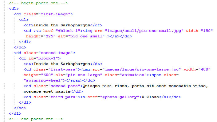
I used definition lists but I could have as easily used unordered lists. Note how the HTML code block for each image is split into two different parts - one for the thumbnail and the other for the full sized image.
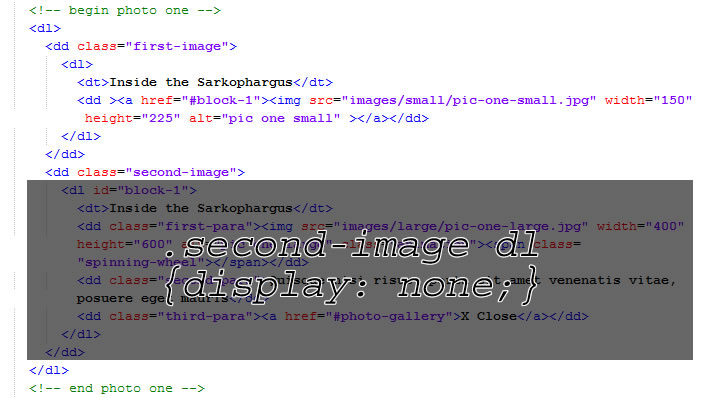
The full-sized image needs to be set to "display: none" so that the initial state for the viewer is one where only the thumbnail is visible:
The Lightbox approach is for the full-sized image to appear after user interaction with the thumbnail.
This is possible with JavaScript events. The small code block below changes the CSS to "display:block" when the user clicks on the thumbnail (Here I use the querySelector() method which only has partial cross-browser support):
var thumbnail = document.querySelector(".first-image img");
var fullSize = document.querySelector(".second-image img");


thumbnail.onclick = function () {

    fullSize.style.disp
lay = "block";


}
The closest we have to JavaScript events in CSS is the :target pseudo-class. I don't know whose idea it was to introduce :target into the CSS3 spec, but its inclusion was a minor act of ingenuity.
Instead of a script event like above it is possible to use the following CSS:
.second-image dl:target {
    display: block;


}
:target works by using a fragment in the URL. The link in the thumbnail has the following fragment: "#block-1". The ID for the full size image is block-1. Clicking on the link with the fragment then triggers the HTML with an ID that is exactly the same as long, of course, as you specify this in your style sheet.
Because it is so different to other CSS, :target may appear a little confusing at first. The best method to become familiar with it is by rolling your sleeves up and experimenting with this pseudo-class on your own code.
:target will become one of the most used CSS3 features in the future. The reason it has only had limited use so far is that it is not supported in Internet Explorer versions 8 and below. I'll discuss workarounds in the next section.
The actual CSS keyframe animation is fairly straightforward:
/* animation for main image */

.second-image dl:target .animation {

    -moz-animation: image3D 2000ms cubic-bezier(0.950,0.050,0.795,0.035);

    -webkit-animation: image3D 2000ms cubic-bezier(0.950,0.050,0.795,0.035);
    -ms-animation: image3D 2000ms cubic-bezier(0.950,0.050,0.795,0.035);

   animation: image3D 2000ms cubic-bezier(0.950,0.050,0.795,0.035);
}


    -o-animation: image3D 2000ms cubic-bezier(0.950,0.050,0.795,0.035);

 /* image3D is used on the main image */
@-moz-keyframes image3D {
    0% {
       -moz-transform: rotateY(90deg);
    }

    100% {


    100% {
       -webkit-transform:
       -moz-transform: rotateY(0deg);
    }
}

@-webkit-keyframes image3D {
    0% {
       -webkit-transform: rotateY(90deg);
    }
 rotateY(0deg);
    }
}


   0% {
       -ms-tran
@-o-keyframes image3D {
    0% {
       -o-transform: rotateY(90deg);
    }

    100% {
       -o-transform: rotateY(0deg)
    }
}

@-ms-keyframes image3D {

 sform: rotateY(90deg);
    }

    100% {
       -ms-transform: rotateY(0deg);
    }
}

@keyframes image3D {
    0% {
       transform: rotateY(90deg);
    }

    100% {


       transform: rotateY(0deg);
    }


}
I will not explain the code above in detail because this article isn't a tutorial on CSS3 animation. For that I would advise you to read introductions written by Tim Van Damme, Louis Lazaris and Tom Waterhouse.
Note in the code above I used Webkit, Firefox, Microsoft and Opera prefixes. As of yet there is no keyframe support in Internet Explorer or Opera but it will be coming soon so it's best to future-proof your code.
JavaScript and Lightbox
On my Mozilla Demo page I had a lot of fun creating a modern take of Lightbox with CSS3. I used box-shadows, the calc() function, gradients and CSS3 transforms. If you turn off JavaScript in your browser and try the demo out in a modern non-IE browser you will see it is in perfect working order.
However, there are are number of pitfalls with a CSS-only approach.
Firstly, CSS3 animation only fires once. This is an issue previously well documented byOli Studholme and Chris Coyier.
CSS3 keyframes animation will only work again if the page is refreshed. One way around is to use transitions instead of keyframes. Another way is to use JavaScript to rebuild the node every time the animation is fired.
In the change_animation() method I remove the old class, clone the relevant part of the DOM, randomly add a new class, delete the online node and replace it with the DOM clone:
change_animation: function (htmlElement) {


   var items, random, regEx, result, key, mainBlock, cloneBlock, parentBlock;


    // below finds the unique key which is in the parent div id

turn (!element.search(_private.REMOVE_SEARCH));
    }


    function removeArrayElement(element, index, array) {
       r
e   regEx = /.([0-9]+)$/;
    result = regEx.exec(htmlElement.parentNode);

 key is then used to find the large image in the overla
    key = result.filter(removeArrayElement).toString();

    // this uniqu
ey
    // this is an alternative to some bonkers DOM transversal method

/ remove previous animation class
    mainBlock.removeAttribute("
    mainBlock = document.querySelector("#block-" + key + " img");


/class", "");

    // In order for CSS animation to run more than once on the same element
    // It is necessary to rebuild the node

t a class at random
    items = this.classes;
    random = items[Math.floor(
    // See for further details: http://css-tricks.com/restart-css-animation/
    cloneBlock = mainBlock.cloneNode(true);

    // sele
cMath.random() * items.length)];

    // rebuild the html adding the new class
    cloneBlock.setAttribute("class", random);

    parentBlock = mainBlock.parentNode;
    parentBlock.removeChild(mainBlock);


    parentBlock.appendChild(cloneBlock);


}
I'm sure you could write less verbose code if you used jQuery.
What this means is the global object user interface is as below:
lightbox.init({

    // declare CSS classes that are used for animation

   classes: ['image3D', 'flipper', 'bulge', 'bouncing', 'side-spin', 'top-spin', 'shadow-play', 'rush']

});
In order to change the animation just add a new class to your CSS and to the JavaScript facade. Referenced above, "top-spin" CSS looks like this:
/* TOPSPIN */

.top-spin {

ation: topSpin 2000ms cubic-bezier(0.000, -0.600, 0.000, 1.650);
    -webkit-
    -moz-ani
manimation: topSpin 2000ms cubic-bezier(0.000, -0.600, 0.000, 1.650);

.650);
    -o-animation: topSpin 2000ms cubic-bezier(0.000, -0.600, 0.000, 1
    -ms-animation: topSpin 2000ms cubic-bezier(0.000, -0.600, 0.000,
1.650);
    animation: topSpin 2000ms cubic-bezier(0.000, -0.600, 0.000, 1.650);
}

@-moz-keyframes topSpin {
    0% {

rotateX(360deg);
       -moz-transfor
       -moz-transform: rotateX(0deg);
       -moz-transform-origin: 0% 50% 0;
    }

    100% {
       -moz-transform:
 m-origin: 0% 50% 0;
    }
}

@-webkit-keyframes topSpin {
    0% {
   opacity: 0.1;
       -webkit-transform: rotateX(0deg);

-webkit-transform-origin: 0% 50% 0;
    }

       -webkit-transform-origin: 0% 50% 0;
    }

    100% {
   opacity: 1;
       -webkit-transform: rotateX(360deg);

 }

@-o-keyframes topSpin {
    0% {
       -o-transform: rotateX(0deg);
       -o-transform-origin: 0% 50% 0;
    }

    100% {
       -o-transform: rotateX(360deg);

 100% {
       -ms-transform: rotateX
       -o-transform-origin: 0% 50% 0;
    }
}

@-ms-keyframes topSpin {
    0% {
       -ms-transform: rotateX(0deg);
       -ms-transform-origin: 0% 50% 0;
    }


 (360deg);
       -ms-transform-origin: 0% 50% 0;
    }
}

@keyframes topSpin {
    0% {
       transform: rotateX(0deg);
       transform-origin: 0% 50% 0;
    }

    100% {


       transform: rotateX(360deg);
       transform-origin: 0% 50% 0;
    }


}
The second issue facing a CSS3 Lightbox is the lack of support in Internet Explorer. Unfortunately, versions 8 and below do not recognise the :target pseudo-class.
One way around this is to use a polyfill such as Dean Edwards IE7.js or Keith Clarke's Selectivizr (the latter has support for IE8 only).
As the Sizzle engine has full CSS3 support I presume as well that you can use jQuery or Dojo.
However, my aim for my demo was to create it fully independent of any other JavaScript library. This is a tough call.
If a browser does not recognise a CSS pseudo-class or pseudo-element it will parse out the entire block of code. That means it is not possible to change the CSS using thestyleSheets object because the CSS block using :target is not there to alter.
My solution was to use the XMLHttpRequest API to save the stylesheets to memory, change :target to a class called ieTarget, remove the old style sheets and then add the new altered CSS to the head. The ieTarget is then dynamically added and removed from the HTML depending on a click event being fired on the thumbnail or full-size close link.
Admittedly, it is quite a drastic move and one that leaves open all sorts of potential bugs and issues.
Lastly, if you are going to use JavaScript for Lightbox then why not use the new Full-screen API. This was introduced into Webkit in 2011 and made its first appearance in Firefox at the beginning of 2012.
The API is relatively straightforward to implement. I did so in the following function:
full_page: function () {


   var img, x, docElm, l;


  img = document.querySelectorAll(".first-image img");


     for (x = 0, l = img.length; x < l; x += 1) {


mbnail
       img[x].addEventListener("click", function (
       // call full screen when clicking on the th
uevt) {

           docElm = document.documentElement;

           if (docElm.requestFullScreen) {

rivate.request_smallscreen();
           }
               docElm.requestFullScreen();
               _private.add_warning();
               _
p else if (docElm.mozRequestFullScreen) {
               docElm.mozRequestFullScreen();
               _private.add_warning();

bkitRequestFullScreen();
               _priva
               _private.request_smallscreen();
           } else if (docElm.webkitRequestFullScreen) {
               docElm.w
ete.add_warning();
               _private.request_smallscreen();
           }

       }, false);

    } // end for loop


}
It is now possible to access the global object in the following interface, with the Full-screen API being switched on and off with a boolean value:
lightbox.init({

    // declare whether you want to use the Full-screen API
   fullscreen: false,

sses that are used for animation
   classes: ['image3D
    // declare CSS cl
a', 'flipper', 'bulge', 'bouncing', 'side-spin', 'top-spin', 'shadow-play', 'rush']

});
Conclusion
You may well wonder if there is a need for a JavaScript fullback for a CSS-based Lightbox, then why not just a use a wholly JavaScript approach and cut out the CSS animation? That, of course, is your pejorative. But let us put the sign up for everybody to read: animation for web design will soon be exclusively done by CSS, not JavaScript. In anticipation of this it makes sense to familiarise yourself with CSS animation now.
Using JavaScript too also means you can gain access to some of the funky new APIs like Full-screen.
If you do use CSS 3d animation then do so with caution. I think it is important to use it subtly rather than creating some garish 360 plus flipping and twisting. To do so would put the animation at the centre of attention rather than the images that are being presented.


0 التعليقات:
Post a Comment