Responsive web design term is related to the concept of developing a website design in a manner that helps the lay out to get changed according to the user’s computer screen resolution. More precisely, the concept allows for an advanced 4 column layout 1292 pixels wide, on a 1025 pixel width screen, that auto-simplifies into 2 columns. Also, it suitably fixes on the smartphone and computer tablet screen. This particular designing technique we call “responsive design”.
Responsive web designing is an entirely different designing version than traditional web designing, and developers(especially fresher) must know about the pros and cons of responsive web designing. This blog is a mighty example of the approach so we will reveal a few facts about the uses of responsive web designing. The basic instinct might be to choosemedia queries to develop a responsive site. However, the hassle one faces with media queries is that new queries can pop up from moment to moment; each time, the user experiences sudden and drastic changes to the look and organization of the site. Experts suggest using some CSS transitions to ease the jump.
Pages that include data tables pose a special challenge to the responsive web designer. Data tables are extremely wide by default, and when someone zooms out to see the whole table, it becomes too small to read. When one tries to zoom in to make it readable, he or she is supposed to scroll both horizontally and vertically to look through it. Well, there are several ways to avoid this problem. Reformatting the data table as a pie or mini-graph is an approved solution. The mini-graph fixes even in narrow screens.
Images in responsive web designs are called context-aware. This particular technique serves the purpose of responsive designing in true sense as the images serve at different resolutions, ranging from larger screens to smaller ones. The scaled images appear to change fluidly with the help of updated developer tools and coding languages, allowing designs to look sharp in every context. Responsive web designing is remarkably different from traditional designing in terms of technical and creative issues, and a careful use of this can do wonders while designing.
Responsive Web Design Examples
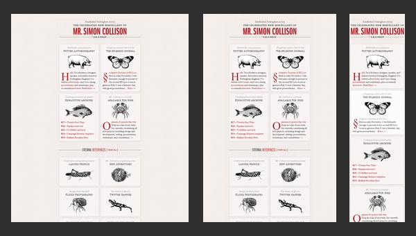
Simon Collison
Though nowadays this greyish grid-style static website looks a bit boring and dull, however when it was released it caused some kind of furor with its high-end layout.
The main reason was that the designer primarily focused its attention on responsive behavior that was only gaining popularity those days thereby providing ordinary developers with a representative example of how regular grid-style layout should gracefully transform.
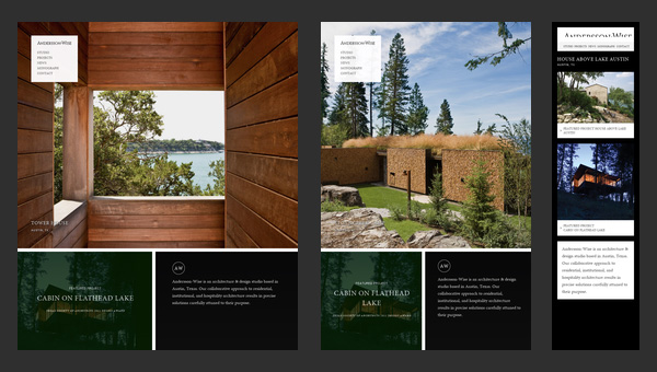
Andersson-Wise Architects
Being dedicated to an architecture and design studio it doesn’t surprising that the main focus of the website are photos that showily represent skills, experience and clients of the company.
The landing page includes 3 main sections, each of which is based on image background. The flexibility solution helps to effectively form a proper structure for every standard screen size, creating a pleasant content flow for readers.
Stephen Caver
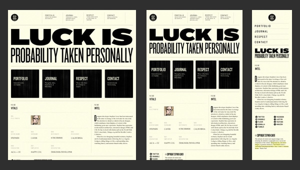
Stephen Caver has a topnotch website when it comes to responsiveness. You will definitely ask, what so special in it. The answer is simple, take a closer look at the front page and you will see; it consists of
- huge welcoming message dished up with a help of a rough typography;
- set of huge blocks that is a duplication of the main menu on the top;
- regular layout for blogging.
So as to say, 3 essential aspects that can be found on every website. The designer gives us a hint of how typography, grid-style markup and blog section should change according to device screen dimensions.
Sparkbox
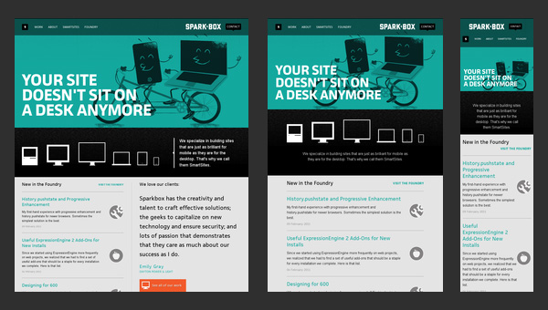
Sparkbox demonstrates a basic structure of a corporate website. The layout is pretty simple; it is based on a standard, commonly-used set of horizontal stripes that present data in a non-intrusive manner. Such structure is really easy to adapt to various screen sizes. The sequential arrangement of blocks deprived of embellishments undergoes changes quite smoothly and effortlessly, giving users a nice-looking and well-organized layout.
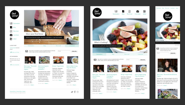
Food Sense
Transformation from a regular left-sided blog-style magazine layout populated with numerous yummy pictures to an elementary block-by-block layout – here is how the main process of adaptation looks like in this website.
However, there is nothing supernatural; it is believed to be a typical solution to a great deal of projects that want to attract online readers from mobile web, win over new audience, and at the same time, save the website’s aesthetics from a visual overload.
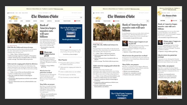
The Boston Globe
The Boston Globe is an excellent example of a well-thought-out news-related website that is based on a responsive layout. The website takes on a conventional approach that is helpful for those who are eager to run its own frequently updated online magazine.
Though as befits, at first sight it seems that the website has a complex, slightly messy outward that is really hard to handle, actually the solution is really primitive. The designer has wisely split all the information into 3 columns, the amount of which decreases according to screen size, slowly but surely passing stages of displaying data in 2 columns and finally in one; in this way you will be also able to set a necessary order of showcasing your blocks.
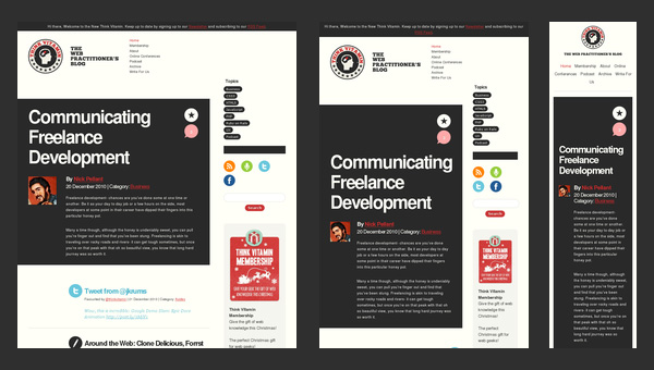
Think Vitamin
To be honest, Think Vitamin can’t boast of anything particular concerning its blog design. It has the same markup as everyone else’s. It has 1 main column with a right-sided widgetized sidebar, a header populated with navigation, a logotype and a search bar, and a footer that presents information via set of blocks.
However, the team not just mindlessly uses a responsive framework as a base; they also actively muster support from some styling elements. Thus, a contrasting color palette helps to distinguish content blocks and some functional elements such as social media and ads, enhancing visual perception for mobile users and reinforces readability.
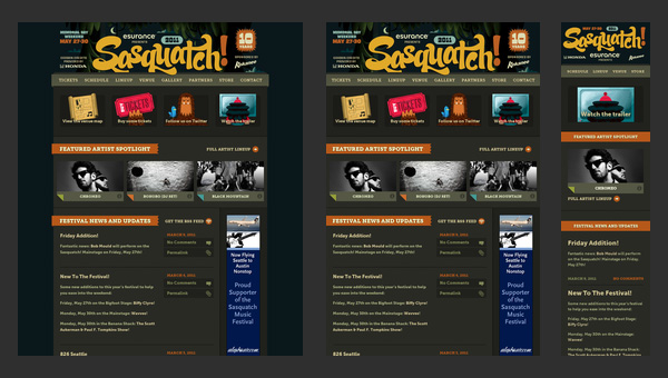
Sasquatch! Music Festival
Sasquatch! Music Festival has to deal with a lot of multimedia content including videos and dynamic effects that in addition is spiced up with some artistic hand-written lettering and fantastic graphics. So for the team, it is quite a challenge to display everything correctly on mobiles and tablets.
Nevertheless, the responsive behavior here is well elaborated. It neatly touches every detail, creating a visually pleasing appearance that doesn’t lose its charm of originality and creativity even on small screens.
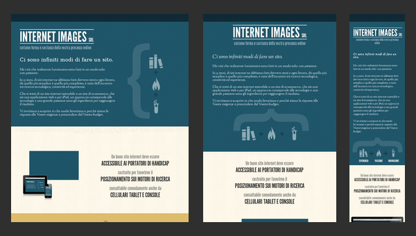
Internet Images
This is another clean well-organized website that is based on a flexible horizontal stripe layout. The responsiveness here is also effectively bolstered by a color differentiation that visually separates one logical block from another.
Such simple yet powerful combination helps to increase readability chiefly on small devices where, as a rule, everything is presented as a one continuous data stream that, because of an inherent monotony, is able to easily destroy all the piquancy and decrease readers’ interest.
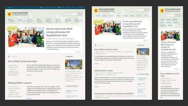
Staffanstorp
Here, an ability of a beautiful adaptation to smaller screens as well as to bigger ones brings such benefits as
- perfect readability regardless of devices that display your website;
- well-structured appearance for increasing information hierarchy;
- easily conveying messages to readers that mostly leverage tablets and mobiles.
Though the blog designs is not differ from others, yet its desire to satisfy current web requirements takes it at the whole new level.
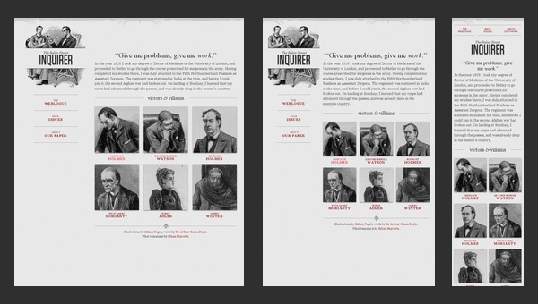
Seminal Responsive Web Design Example
As the nameplate implies, the website serves as a perfect example of a responsive design. It even has a proper title “A Flexible Grid”, so it becomes clear that everything here is riding on rules of graceful degradation. As expected, the team pays more attention to an ideal data presentation rather than to aesthetics, so styling goes into the shadows.
The demo page includes navigation, a text block, grid-style area and even illustrated logotype, so to speak covers a minimum of integral elements. The team showcases how sizes of logical divisions and arrangement should properly change in order to provide users with an excellent experience on portable devices.
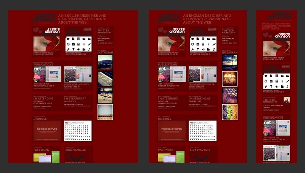
Naomi Atkinson
Naomi Atkinson leverages a mosaic-style layout for the front page. This solution is widely-used among those who want to immediately shed a light upon its artworks by creating online portfolios.
The website is worth mentioning not because of its design, since, to put it mildly, it leaves much to be desired but due to its functional side that is quite intelligent. The designer employs irregular grid that nicely transforms into a correct grid once you start minimizing your browser window. And that’s not all; metamorphoses are supported by pleasant effects that add dynamics and attractiveness to the project.
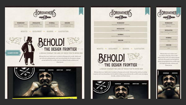
Forefathers Group
What can you say about this website? It certainly conveys a distinct, quite overwhelming impression with its matchless, sophisticated design. The team has not stinted on the artistry that manifests itself in various moments.
The website charms with its incredible retro-style typography, fantastic hand-drawn illustrations, textured background, and amazing graphics; and these all embellishments skillfully co-work with textual content that takes up a special place in the design.
So as you can see, the team has to take into account lots of details in order to turn the website into a comfort place that will satisfy needs online visitors that surf the website via various pocket devices.
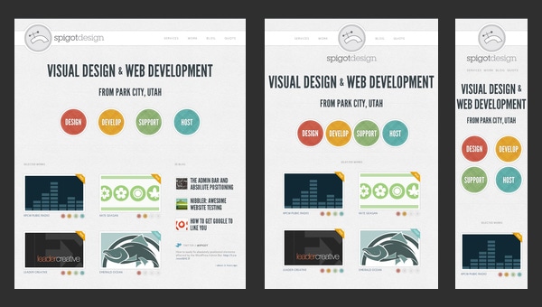
Spigot Design
Here, the responsive behavior should leave an imprint not only on a standard layout that includes grid-style and line-by-line data presentation but also on intro video, dynamic graphics and of course, menu.
Bearing everything in mind, the team is managed to provide online audience with an elegant design spiced up with some charming effects and full of whitespaces that nicely reflect data regardless of screen dimensions.
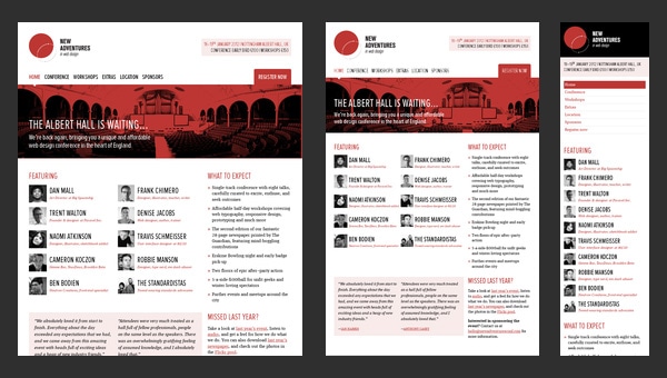
New Adventures In Web Design Conference 2012
Being based on a flexible grid allows the organization to win over as many potential visitors as it possible. And in this case, this quality not only contributes to the appearance of the website but also unobtrusively supports the event that it publicizes. Since the website is dedicated to web design conference, it is highly desirable to demonstrate regular users that the team is aware of current web requirements and rigidly sticks to them. So building a website with all specifications is an important move towards a success.
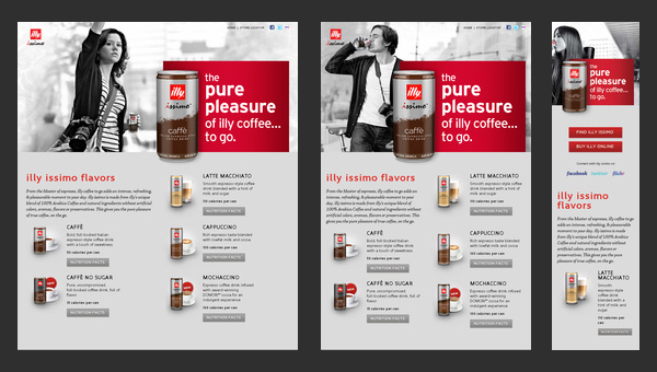
Illy Issimo
The responsiveness is an essential feature of every high-quality promotional website that understands rules of attraction. Illy Issimo got the hang of it and used a flexible grid in order to
- provide a pleasant user experience;
- extend a targeted audience;
- draw in potential customers that use small devices.
So as a result, its advertisement campaign is certainly out in front.
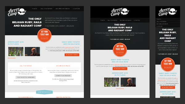
Arrrrcamp Conference
The website focuses more on text rather than on multimedia. Thus, the large part of the website is based on a white monotone background that nicely underlines text and some trendy “ghost” buttons.
The front page undergoes changes once you resize your browser window; it ably supports all resolutions starting from 1920px and ending up with 240px that is really convenient since Ruby-lovers definitely know how to use tablets and mobiles in search of necessary stuff such as conferences in internet.
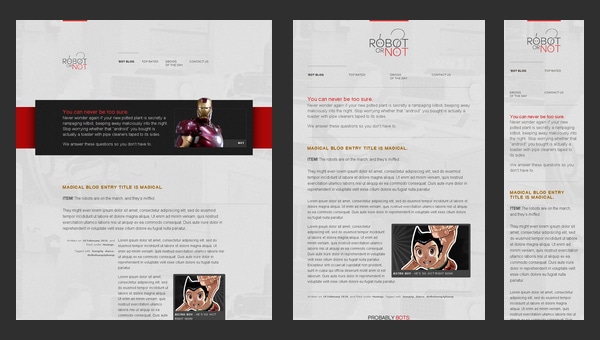
Robot or Not?
Robot or Not? is a demo website that puts a flexible grid in action.
Featuring an equal mix of textual and multimedia data that takes up the whole browser screen (as is often the case) and stripping away all the decorations and creative styling, the team tries to make from the regular page an excellent example for newbies that want to vividly understand basic transformations that happens with the layout when it adapts to various screen dimensions.
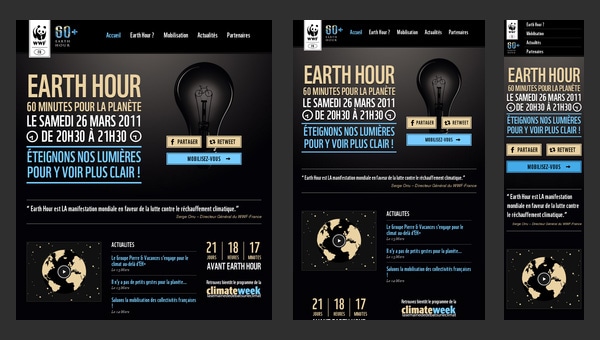
Earth Hour
Earth Hour is a really advanced and complex website that is filled with lots of multimedia including both videos and eye-catching photos. Moreover, it is also an online infographic that utilizes some beautiful graphics and smooth transitions in order to draw attention to the issue.
Unfortunately, the adaptation is not well-crafted and fully elaborated, since the website suffers from some inconsistencies starting from tablet version, to say nothing of displaying on a much smaller devices such as mobiles.
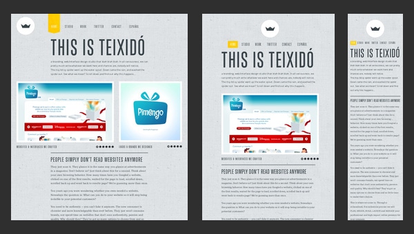
Teixidó
The creative team resorts to an ingenious approach of using textures, fantastic drawings and illustrations in order to effectively set its company online and make it look unique and eye-catching.
An artistic side is absolutely stunning. How about an ability to skillfully adapt to competitive environment? Here is also all present and correct. Though the website is static, there are no magnificent effects or dynamic zest, yet the responsive behavior dramatically contributes to the users’ experience, saving the day.
Ribot
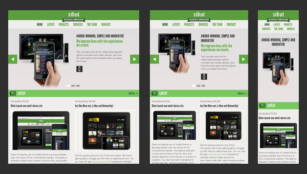
Ribot is a high-end digital design studio which specializes in mobile, tablets and beyond – as the title says.
The key words here are mobile and tablets, it means that the team concentrates on creating designs that will be suitable for namely such devices, so it’s not surprising that the website design itself also easily blends into screens of such gadgets, nicely displaying information and providing regular online visitors with a proper way of exploring company’s services and possibilities.
Deren Keskin
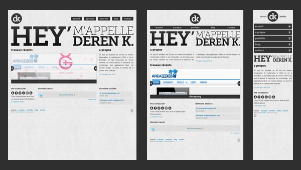
Deren Keskin has a compactly arranged, clean online portfolio that obviously resorts to a rule that every web page should occupy only browser screen, even blog falls under this requirement.
The same goes to modified (according to responsive scheme) layouts, so everything is compressing until the whole structure perfectly fits into a screen regardless of its dimension. Furthermore, the designer is managed to save all the proportions and relationships between integral components in order to save and carefully identify the previously set priorities of some elements.
Sweet Hat Club
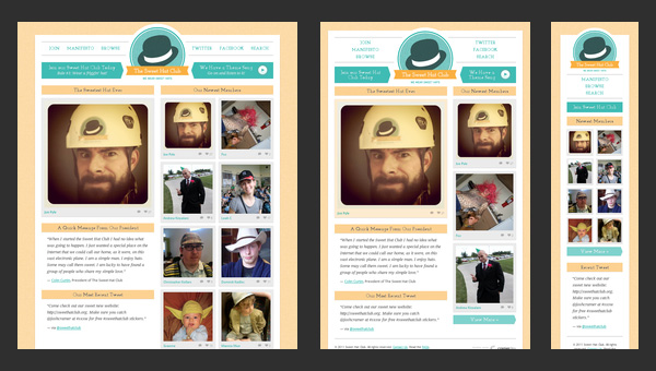
Much like the previous example, the content is tightly packed together. The newspaper-style layout is aimed to predominantly feature images since the website is an online club of those who like to wear hats.
The textual filling here is quite optional, so the responsive grid should chiefly take care of properly modifying image sizes and fitting them into new dimension. What is worth attention here is that even the mobile version of a website includes 2 columns as the original one.
Glitch
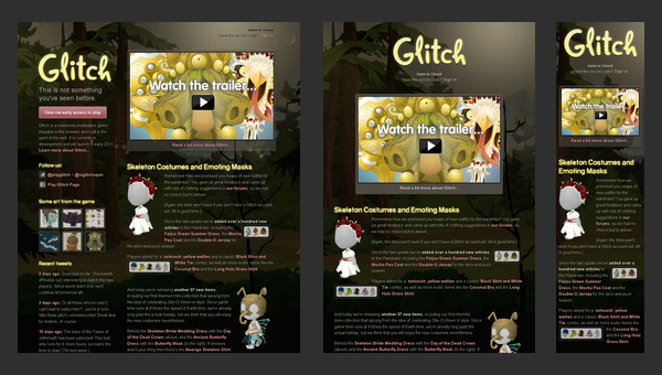
At the present time the website is closed. The home page includes some information about the previous project activity, helpful links and characteristic illustrations. This is only one static web page that is reminiscent of the old days.
However the non-working status in no way affects the responsive behavior that is inherent to the website. Even now, being out of service, it continues to complying with web requirements and formally notifying users about its current status whether they stumble upon the website sitting at his computer or using a cell-phone.
dConstruct
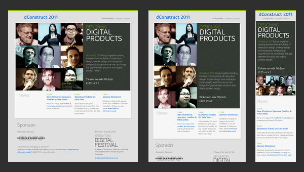
dConstruct is a website dedicated to conference and workshops that take a look at perceptions of technology and culture. Though the design is quite primitive, yet the informative side is really well-thought-out. Thus, the front page draws your attention to only 3 main moments:
- speakers and workshops’ teachers;
- description about the event;
- sponsors.
Those are the main things that worry potential visitors and need to be instantly highlighted.
Adaptive Web Design
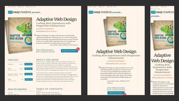
As the nameplate implies, the website is concentrated on adaptive issues. To be more precise, this is a promotional website that advertises a book that will answer all you questions.
So it’s quite predictable that the developer leverages it as a tool for showcasing its skills through providing users with a representative example of how should a regular website behave when users come to it from various devices.
Authentic Jobs
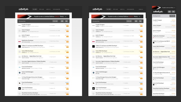
Authentic Jobs is an online directory that is aimed to unite employers with job seekers. It traditionally displays data via a list-style layout that is quite elegant and easy to handle when it comes to adding versatility via incorporating responsive behavior.
The transformation does not cause much trouble, since the structure stays the same; the only thing that undergoes changes is a sidebar which is moved down the hierarchy by giving way to more relevant and priority data.
Five Simple Steps
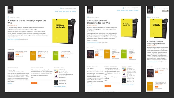
The website of Five Simple Steps has a clean appearance that features only some kind of valedictory speech and a list of helpful stuff from those who previously run this website.
Staying responsive till the end is a good rule of etiquette, and the company is perfectly conscious of this. Even being closed, the website continues to meeting current web requirements and supplying its mobile and tablet readers with a perfect readability.
Splendid
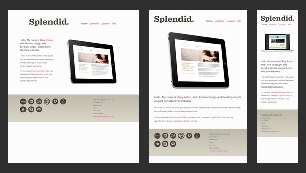
Splendid is a simple online portfolio that emphasizes users’ attention on artist skills and experience. You will not find neither fantastic illustrations nor ingenious effects; the designer takes a minimal approach in order to present himself, and it definitely stands in a stark contrast to other sophisticated creatives’ websites.
In this particular case, the minimal design doesn’t mean minimal functionality. The artist feels that the responsive design is and will be the primary focus, so he takes care about a proper adaptation to huge and small screens.
Ryan O’Rourke
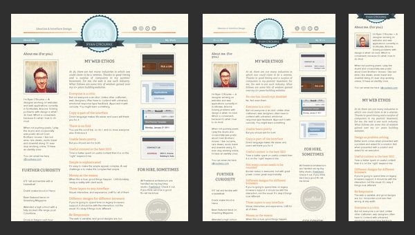
When you run into online portfolio of Ryan O’Rourke, it seems that the designer is guided by the wise phrase “brevity the soul of wit” and realizes it literally. Minimalism, minimalism and again minimalism…there is only one web page that features one sentence, email and small gif animation that shows off his activity. However much like the previous example, the website is based on a responsive framework that makes the website ready for mobile web audience.
FlexSlider
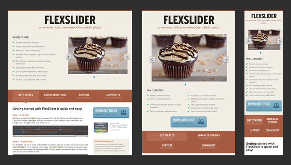
FlexSlider is a lightweight jQuery slider from WooThemes with simple semantic markup and numerous valuable features that was created to become your reliable companion for an ideal image showcase on every popular device.
Nevertheless, the web page that promotes the product, unlike the slider itself, is not as adaptive as it should be. Unfortunately, the team has missed this point that really disappoints.
El Sendero del Cacao
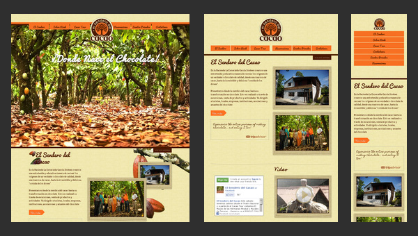
El Sendero del Cacao has a visually-appealing website with a calm and warm atmosphere that is achieved with a help of soft coloring, spectacular images and appropriate graphics. Moreover, thanks to such integral features as
- responsive layout;
- cross-browser compatibility;
- easy navigation;
- multi language support.
the website is able to unobtrusively force users to indulge in an enjoyable pastime.
Do Lectures
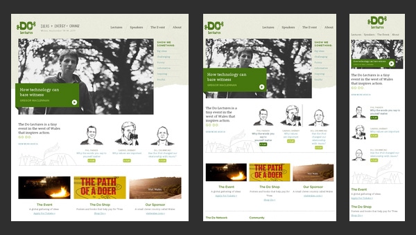
Do Lectures is a regular blog that makes use of a 3-column format layout that effectively copes with lots of news and posts populated with images. The website has an old-timey feeling because of its conventional markup and lack of any dynamic elements.
Coming with the retina support, the website looks fantastic on huge desktop and notebook screens, whereas on small tablet and mobile screens everything is not so rosy. The responsiveness, unfortunately, is not fully thought-out here, leaving users of mobile web with ill-suited horizontal scroll bars.
St Paul’s School
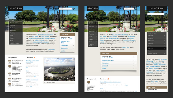
Nowadays, a great deal of educational institutions has their own websites. Even the official page of the St Paul’s School is not lagging behind others, having a website with
- an appropriate discreet appearance;
- highly informative home page;
- comprehensive navigation;
- and of course, mobile and tablet friendliness.
And concerning schools, it is really something. Having a fully adaptive well-crafted website that not only reveals necessary information but also has a pleasant design supported by flexible grid looks like a jump above its head.
Naomi Atkinson Design
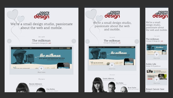
Naomi Atkinson Design is a small passionate UK-based design studio that has a tightly-packed together website. The team employs a boxed-style layout with centered content diluted with minimalism that is aimed to:
- briefly but efficiently display data;
- instantly catch the viewers’ focus and draw attention to portfolio items;
- provide users with a handy instrument for quick feedbacks.
Moreover, such layout is really easy to turn into responsive one, so it’s quite beneficial solution.
Ben Handzo Photography
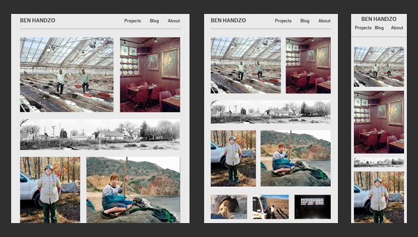
After casting a mere glance at the website, it becomes clear that the artist is simply obsessed with photos. The home page of his online portfolio is packed with images; there is absolutely no text, with the exception of navigation and small panel placed on footer. Moreover, being bolstered by a responsive grid that handle all the inconsistencies occurring during adaptation to smaller screens, the website brings benefits not only to the owner but also to online visitors by giving them a chance to enjoy spectacular works no matter where they are.
Stunning CSS3 Media Queries Example
As you have already noticed this is another website in our collection that is dedicated to responsive solutions called media queries that are highly popular among developers nowadays.
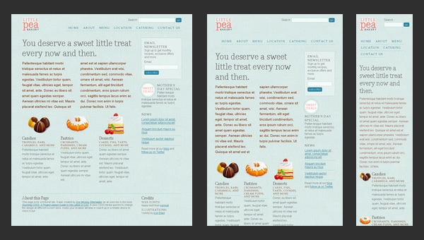
Of course, the design, styling and semantics are quite primitive here, however they are not highlights; the flexible grid that plays a role of a solid foundation for this project is a true star here. The website serves as a mere example that graphically formulates the rules of graceful degradation for a standard 4-column layout.



I love how the blogger did their research beforehand and I believe that this was written correctly.
ReplyDeleteBackground Removal Service/Clipping Path/Clipping Path Service/Neck Joint Service/Image Masking Service/Color Correction Service
All responsive web design collection are awesome, thanks for your awesome collection.
ReplyDeleteImage Clipping Path
Image Masking Services
Image Cutout Service
Background Removal Service
Multiple Clipping Path
Drop Shadow Service
Photo Editing Service
Neck Joint Service
Photo Retouching Services
Excellent article. Very interesting to read. I really love to read such a nice article. Thanks! keep rocking.
ReplyDeletewordpress web design
Thank you very much for this great post.
ReplyDeleteAirconditioning
Thanks for sharing these examples!
ReplyDeleteThey all look pretty great
Melbourne Web Developer