


I'm sure you all are using viewport meta tag for responsive design, but did you know that the viewport tag can also be very useful for non-responsive design? If you haven't got the time to convert your design to responsive yet, you should read this article on how to use viewport tag to improve the appearance of your design on mobile devices.
General Use of Viewport Tag
Viewport meta tag is generally used for responsive design to set the viewport width and initial-scale on mobile devices. Below is a sample viewport tag.
<meta name="viewport" content="width=device-width, initial-scale=1.0">Using Viewport Tag for Non-responsive Design
As you may know, the default viewport width on iPhone is 980px. But your design might not fit in that range. It could be wider or narrower. Below are two examples where you can utilize the viewport tag to improve the rendering of non-responsive design on mobile devices.
Example
Take a look at the Themify site on your iPhone.
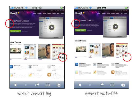
The screenshot on the left shows how the site would render without the viewport tag. As you can see, the page is touching on both sides. I added viewport tag to specify the viewport width to 1024px so it leaves some margin space on the left and right sides.
<meta name="viewport" content="width=1024">Another Example
If your design is too narrow, it might also cause an issue. Lets say the container width of your design is 700px and it is not responsive, it would look like the screenshot on the left where there is a big empty space on the right.
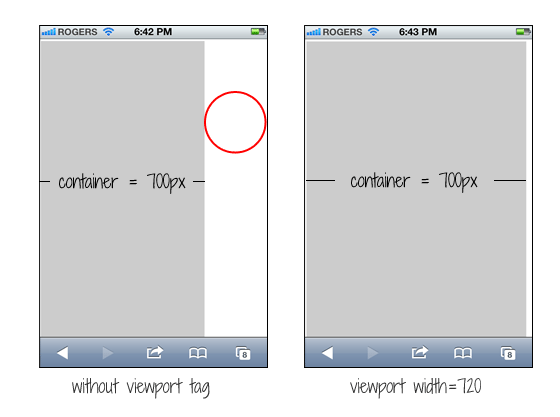
You can simply fix this by setting the viewport width to 720px. The width of your design doesn't change, but iPhone will scale it to fit in 720px.
<meta name="viewport" content="width=720">Common Mistake
A common mistake is that people often apply initial-scale=1 on non-responsive design. This will make the page render at 100% without scaling. If your design is not responsive, users would have to pan around or zoom out to see the full page. The worst case is combining user-scalable=no or maximum-scale=1 with initial-scale=1. This will disable the scaling and zooming capability of your site. With scaling disabled, users have no way to zoom out to see the complete page. Remember: if your design is not responsive, do not reset the initial-scale or disable scaling!
<meta name="viewport" content="initial-scale=1, maximum-scale=1, user-scalable=no">


0 التعليقات:
Post a Comment